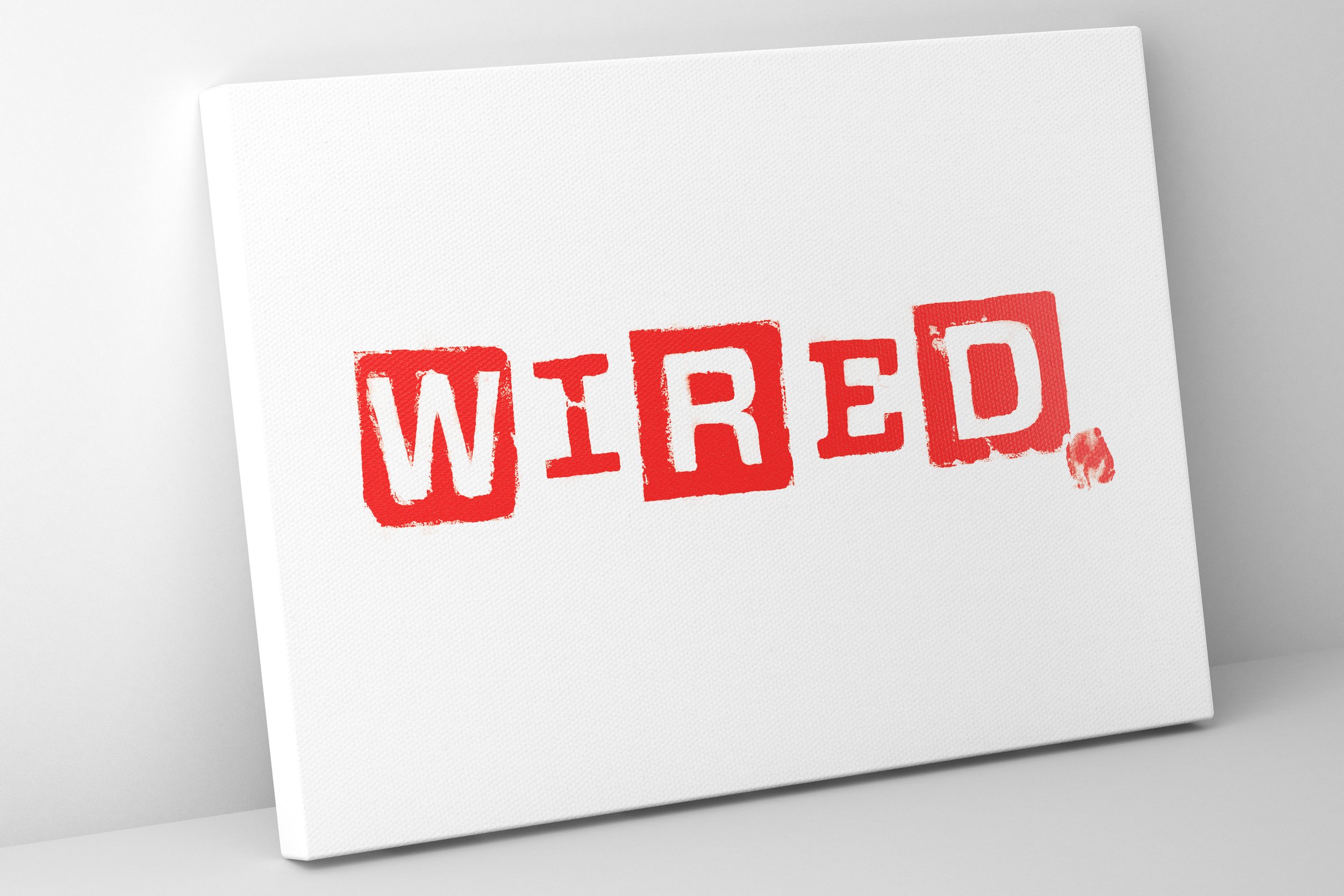
Wired potato print
Role: Art Director
Client: Wired Magazine
Art direction | prop styling | graphic design
I love working with type and was thrilled to be presented with the opportunity of reinventing the Wired UK magazine masthead for a food themed Issue featuring Jamie Oliver on the cover. I pitched an ambitious idea; carving real potatoes and making a potato print of the iconic Wired brand logo. Research for the best potato for carving ensued. After sourcing suitable potatoes, I intricately carved type into them with a scalpel. Each potato letter was then printed to create the finished masthead, carefully matching the red paint to Wired's brand colour palette.


Type
Role: Art Director
Client: Personal
Art direction | type design
Original, unique and bespoke typography designs.

